 EN
EN AR
AR RU
RU ZH
ZH FR
FR ES
ES
August 08, 2026 • By KWD
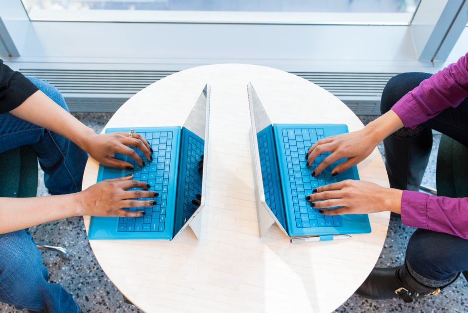
App design trends worth adopting in 2026 are those that reduce friction, clarify user intent, or improve accessibility—not decorative features. They must serve users and measurable business goals like onboarding speed, retention, and task completion.
Key Takeaways
- Purposeful motion and micro-interactions should confirm actions or guide navigation, never add wait time or decoration.
- Personalization works best when it adapts quietly to user behavior and is transparent, never intrusive or surveillance-like.
- Dark mode requires tuned contrast, rethought color, and respecting system settings, especially important in Kuwait's night-use patterns.
- Accessibility—legible fonts, sufficient contrast, large tap targets, and screen-reader labels—improves clarity for all users, not just those with disabilities.
- Native Arabic and RTL design from the start, not translation, makes bilingual apps feel local and trustworthy in the Gulf market.
Every year brings a fresh wave of shiny interface ideas, and every year most of them quietly disappear. The app design trends 2026 worth your attention are not the ones that win a dribbble screenshot; they are the ones that make people finish what they started, come back tomorrow, and tell a friend. As a Kuwait agency that has designed and built bilingual apps for more than a decade, we judge every trend by one test: does it serve the user and the numbers? This guide covers the trends we actually recommend, why they work in the Gulf market, and where native Arabic design gives local apps a real advantage.
Why app design trends 2026 only matter when they grow the business
It is easy to confuse a trend with progress. A dramatic loading animation or a novel gesture can feel modern and still cost you users if it slows people down. When we evaluate app design trends 2026, we ask what each one does for the three things that decide whether an app succeeds: how quickly a new user understands it, how often existing users return, and how reliably people complete the action that matters.
Trends that pass this test share a trait: they reduce friction or add clarity. Trends that fail it usually add decoration or complexity. Keep that lens in mind as you read, because a technique that is right for one app can be wrong for another.
Purposeful motion and micro-interactions
Motion is one of the strongest mobile UI trends 2026, but only when it has a job. Good animation is not there to impress; it is there to explain. A button that gently responds to a tap confirms the app heard you. A list item that slides as it is deleted shows what just happened. A smooth transition between screens tells the user where they came from and where they are now.
Where micro-interactions earn their place
- Feedback: confirming a tap, a save, a successful payment, or an error, so users are never left guessing.
- Orientation: transitions that connect screens so navigation feels like moving through one space, not jumping between unrelated pages.
- Delight in moderation: a small, well-timed flourish at a meaningful moment, used rarely enough to stay special.
The failure mode is motion for its own sake: long animations users wait through, effects that fire on every scroll, and transitions that add half a second to every action. Our rule is simple. If an animation makes the app feel faster or clearer, keep it. If it makes people wait, cut it, and always respect the phone's reduce-motion setting for people sensitive to movement.
Personalization that adapts to real behavior
Among 2026 app design trends, personalization is one of the most valuable and the most misused. Done well, it means the app quietly adapts to how each person uses it: surfacing the actions they take most, remembering their preferences, and getting out of the way of the things they never touch. Done badly, it means a wall of intrusive prompts and a feeling of being watched.
The trustworthy version of personalization is honest and useful. Show returning users their most-used features first, and remember their language, their location, and their last choices. If you are exploring smarter suggestions, thoughtful AI-driven features can help apps adapt without becoming creepy. The line to hold: personalization should feel like the app knows you, not like it is following you. Make it clear what is being remembered and give people an easy way to reset it.
Dark mode UX done properly
Dark mode is no longer a novelty; in 2026 it is an expectation. But strong dark mode UX is more than flipping a switch and inverting colors. A rushed dark theme produces muddy contrast, glowing text that is hard to read, and brand colors that look wrong against a black background.
What a proper dark mode needs
- Tuned contrast: pure white text on pure black is harsh; softened tones are easier on the eyes during long sessions.
- Rethought color: brand and accent colors often need adjusting so they stay legible and on-brand in the dark.
- Depth without shadows: in dark interfaces, subtle surface shades replace the drop shadows that signal layers in light mode.
- Respecting the system: the app should follow the phone's light or dark setting by default and let users override it.
This matters in Kuwait, where a lot of phone use happens at night. A comfortable dark mode is not a nice-to-have here; it is part of a considerate experience, and on OLED screens it can even help with battery life.
Accessibility as a baseline, not an add-on
The most durable of the mobile UI trends 2026 is treating accessibility as a starting point rather than a final checklist. Legible font sizes, sufficient color contrast, tap targets big enough for real thumbs, labels that screen readers can announce, and support for the phone's own text-size settings all make an app usable for more people, including older users and anyone in bright sunlight.
The quiet benefit is that accessible design is simply clearer design. When you make an interface work for people with low vision or motor difficulty, you almost always make it easier for everyone else too, so doing the right thing and improving your numbers point the same way.
Native Arabic and RTL design for the Gulf market
This is where local apps can genuinely pull ahead, and where a lot of imported designs fall down. Native Arabic app design is not translation. It is designing the Arabic experience with the same care as the English one, so an app feels built for its audience rather than adapted for it.
What real bilingual design looks like
- True right-to-left layout: the whole interface mirrors, so navigation, icons, progress, and back gestures all sit where an Arabic reader expects them, not just the text direction flipped.
- Typography chosen for Arabic: a typeface designed for Arabic script, with the right size, weight, and line spacing, instead of a Latin font forced to display Arabic.
- Logical layouts, not hard-coded sides: spacing and alignment defined by start and end rather than fixed left and right, so a single design serves both languages cleanly.
- Equal polish in both languages: the Arabic version gets the same attention to detail as the English one, because for many users in Kuwait Arabic is the version they will actually use.
We design apps to be bilingual in English and Arabic from the first screen, because in the Gulf that is what real inclusivity looks like. An app that treats Arabic as a first-class experience feels local, trustworthy, and respectful, and that shows up in how people engage with it. Our mobile app development in Kuwait and web design in Kuwait City both start from bilingual, RTL-ready foundations.
Our rule for adopting any of the app design trends 2026
You do not need to chase every trend on this list, and you should not adopt all of them at once. The right mix depends on your users, your goals, and your budget. What stays constant is the filter. Before we ship any of these app design trends 2026 into a client's product, we ask one question: does it serve the user and the goal? If a trend makes the app clearer, faster, more inclusive, or more useful, it earns its place. If it is only there to look current, it does not, no matter how good it looks in a portfolio.
Thinking about a new app or a redesign built for Kuwait, in both English and Arabic? Let's talk about which of these trends actually fit your users and your goals, and skip the ones that do not. Get a free quote and consultation, or message us on WhatsApp, and we will help you design an app that grows your business rather than chasing what is fashionable.

