 EN
EN AR
AR RU
RU ZH
ZH FR
FR ES
ES
2026年8月27日 • 作者 KWD
A website or mobile app can look polished and still lose customers. If users cannot quickly understand what a business offers, find the next step, or complete a key task, the visual finish will not compensate. A disciplined ui ux design process prevents that gap by connecting business objectives, user expectations, content, technology, and interface decisions before development begins.
For companies investing in a new website, portal, e-commerce platform, or mobile application, UX is not a decorative phase. It is a practical method for reducing uncertainty. It helps teams decide what to build, what to simplify, and where to focus effort so the final product supports real customer behavior and measurable commercial outcomes.
Why the UI UX Design Process Matters to Business
UI and UX are closely connected, but they solve different problems. User experience, or UX, addresses how a customer moves through a digital product: what they need, what they expect, where they may hesitate, and how efficiently they can reach a goal. User interface, or UI, is the visible layer: layouts, typography, colors, components, forms, buttons, and interactive feedback.
A strong experience needs both. A clear user journey with an inconsistent interface feels unreliable. A beautiful interface with poor navigation creates friction. The right process brings these disciplines together while keeping business priorities in view, whether the objective is generating qualified leads, increasing online sales, reducing support requests, improving service access, or modernizing an internal workflow.
This is especially relevant for organizations with fragmented digital systems. A corporate website may not reflect the sales process. An application may ask users for information the business already has. A campaign landing page may attract traffic but provide no compelling path to inquiry. Design work should identify these breakdowns early, before they become expensive development changes.
1. Start With Discovery and Clear Business Goals
Every effective project begins with questions, not screens. The discovery stage aligns stakeholders on the reason for the project, its audiences, its technical constraints, and its definition of success. This is where a design partner learns how the business operates rather than assuming that a competitor's website provides the right model.
Useful discovery conversations cover the company’s services, sales cycle, customer segments, brand positioning, existing analytics, content limitations, and operational requirements. For a Kuwait-based service company, for example, trust signals, bilingual considerations, fast contact paths, and mobile behavior may deserve more attention than a complex product catalog. For a corporate portal, user permissions, approval flows, and integration requirements may be the central concerns.
Goals should be specific enough to guide decisions. “Make the site modern” is a preference, not a measurable objective. “Increase qualified consultation requests,” “help distributors locate technical documentation,” or “reduce checkout abandonment” gives the team a standard against which to evaluate every design choice.
Define what success looks like
The best projects establish a small set of primary actions. On a lead-generation website, this may be requesting a quote, booking a consultation, or calling a specialist. On an e-commerce platform, it may be finding a product, comparing options, and checking out. Supporting metrics such as form completion rate, conversion rate, page speed, task completion time, and repeat visits can then show whether the experience is working after launch.
2. Research Users, Content, and the Market
Research does not always require a lengthy enterprise study. The level of research should match the project’s scope, risk, and available evidence. A focused review of customer inquiries, sales feedback, search behavior, support tickets, and website analytics can reveal recurring user needs quickly. Interviews with customers and internal teams add context that traffic data alone cannot provide.
The goal is not to create fictional personas for a presentation. It is to understand the decisions people are trying to make. What information do they need before contacting the business? What concerns slow them down? Which terms do they use? Are they browsing from a phone, comparing vendors at work, or returning to complete a task later?
Competitive review is useful when it examines patterns rather than copies visuals. A competitor may use a prominent calculator, a detailed comparison table, or a simplified navigation structure because customers expect those tools. But duplicating another company’s layout without understanding its audience can weaken differentiation. The stronger approach is to identify market expectations and then create a clearer, more distinctive response.
3. Build Information Architecture and User Flows
Once the team understands objectives and user needs, the product needs a logical structure. Information architecture organizes pages, features, and content so users can predict where to go next. It determines navigation labels, page hierarchy, content grouping, and how deeply important information is buried.
User flows turn that structure into task-based paths. A flow may map how a prospective client moves from a service page to a case study, then to a quote request. Another may map a returning customer logging in, locating an invoice, and submitting a support request. Mapping these routes exposes unnecessary steps, unclear handoffs, and missing information before interface design begins.
This stage often requires trade-offs. A business may want to place every service, message, promotion, and announcement on the homepage. Users, however, need a clear hierarchy. Prioritizing one primary action does not remove other content. It gives people a path through it without forcing them to process everything at once.
4. Create Wireframes Before Visual Design
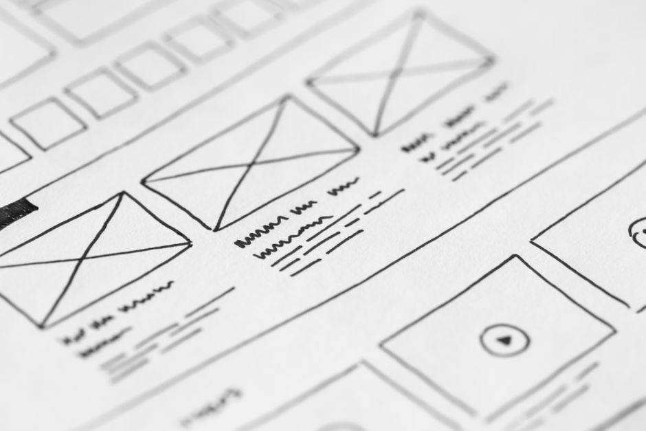
Wireframes are low-detail page or screen layouts that focus on structure. They show what appears on a page, in what order, and why. Without the distraction of colors, imagery, or polished typography, stakeholders can assess the elements that most affect usability: page hierarchy, messaging, navigation, calls to action, forms, and content placement.
This is also the right time to review mobile behavior. Mobile design is not simply a desktop layout compressed into a narrower width. Navigation patterns, tap targets, content order, image use, form fields, and page performance all need deliberate choices. For many businesses, mobile users represent the first interaction with the brand, so a poor mobile experience can directly affect lead quality and customer confidence.
A custom wireframe process is more valuable than starting from a generic template because it reflects the company’s actual offer and customer journey. Templates can be appropriate for low-risk, basic requirements, but they often create compromises when a business needs distinctive functionality, complex content, integrations, or a stronger conversion strategy.
5. Develop the UI System and Interactive Prototype
After wireframes are approved, the visual interface gives the experience a recognizable and credible identity. This includes brand-aligned colors, typography, spacing, imagery direction, iconography, button styles, form states, and reusable content components. Consistency matters because users learn patterns. When similar actions look and behave differently from page to page, the product feels harder to use.
A UI system should also support future growth. Instead of designing isolated pages, the team creates reusable components for cards, accordions, navigation, alerts, content blocks, and calls to action. This makes future updates faster, helps maintain brand consistency, and reduces the risk of a website becoming visually fragmented after several rounds of edits.
Interactive prototypes allow stakeholders and selected users to experience important paths before code is written. They can test whether a menu feels intuitive, whether a form asks for too much, or whether a booking flow provides enough reassurance. Fixing a confusing step in a prototype is faster and more cost-effective than correcting it after a full build.
6. Validate, Build, and Optimize
Testing is not a final checkbox. It should continue throughout the UI UX design process. Usability testing can be formal or lightweight, but it should ask real people to perform realistic tasks. If users repeatedly misunderstand a label or fail to find a key service, the issue is not solved by explaining the design. The design should be improved.
Development then translates approved designs into a functioning product. Close collaboration between designers and developers is essential here. Performance, accessibility, browser behavior, content management needs, and technical integrations can influence the final experience. A design that appears impressive in a static file but loads slowly or cannot be maintained reliably is not a successful business solution.
Before launch, quality assurance should cover responsive behavior, links, forms, validation messages, navigation, loading speed, basic accessibility, analytics tracking, and key device scenarios. After launch, analytics and customer feedback provide the evidence for refinement. Digital products should evolve with the business rather than remain unchanged for years.
Choosing the Right Level of Design Investment
Not every project needs the same depth of research, prototyping, or testing. A focused campaign page may need a rapid discovery workshop and a streamlined conversion flow. A customer portal handling sensitive data or complex user roles requires deeper analysis, more edge-case planning, and thorough validation. The right investment depends on the cost of getting the experience wrong.
At DATA, the objective is to treat design as part of a broader digital implementation strategy, connecting the customer journey with custom development, performance, search visibility, and reliable ongoing support. That approach helps businesses avoid the common problem of receiving an attractive design that cannot deliver operational or commercial value.
The most useful question is not whether a new interface looks more modern. Ask whether it helps the right person make the next decision with greater confidence. When design answers that question consistently, it becomes a practical driver of trust, conversion, and long-term digital growth.

